I moved into my apartment last year April and it's not done and is constantly being redone. My poor husband and baby have to put up with me rearranging everything and I always want him to love what I've done. He's not great with change so by the time he likes something, I've decided to change it; It's a tough cycle for him. My apartment is my free zone to experiment with different lay outs, color combinations and materials. When you first move into a place it's hard to know how the space will be used and I found with myself that it took some time to find a good balance with my apartment after I was living in it. Maybe I'll start telling future clients that I'll do a better job if I move into their home for a short while.
So let's look at my place when we first moved in:
Entry ways are always the best way to showcase your style. Even if you don't have an actual entry way it's easy to create one. In the beginning mine was the picture above. A vase full of branches and multiple gold flower bowls. Two things could of been going on in my head; it was hard for me to decide between three of the same things so I just displayed all of them or I thought we would be sharing an apartment with other families so we would need a lot of space for keys.
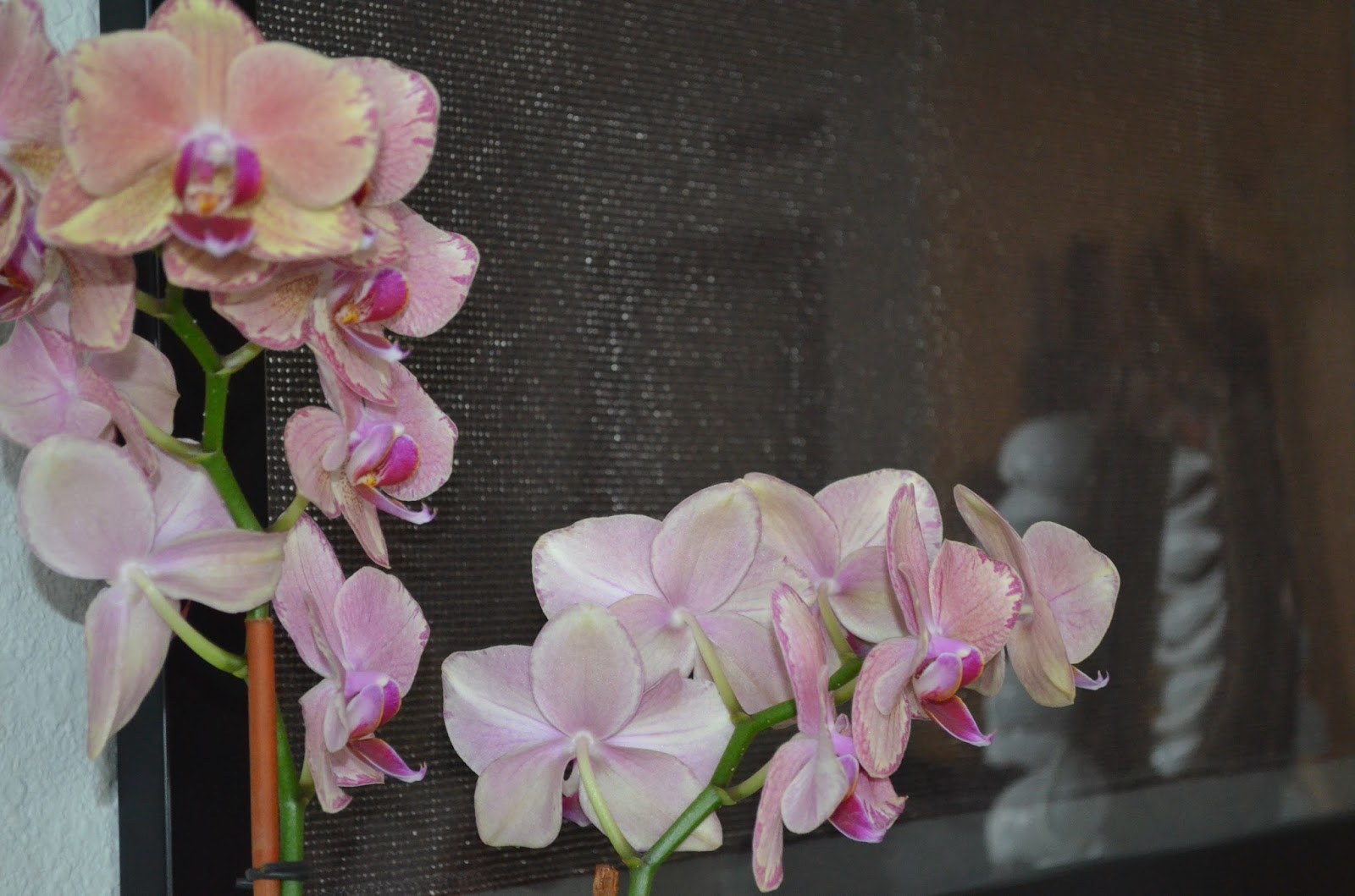
This is the entry way now and I settled on one gold flower bowl and it's more than enough. The shell necklace I purchased on a trip home to Australia. I was told it was a tribal head piece but it could easily be shells sewn onto fabric. Either way I love it, and the orchid is perfect there, it brings in color and height.
I once got a sample of fabric that I loved and instead of using it I framed it.
The apartment isn't this dark, it's the lighting of this picture. The table, lamps and accessories are all great, but it feels very empty and that dorm-like window stands out like a sore thumb. A tip for my old self, if you're going to buy an awesome bronze mail stand, make sure you fill it up with mail instead of two pieces of paper bent over like that. I feel hopeless looking at that mail, it's so depressing.
The curtains do an amazing job at hiding that window and adding some layers. Those curtains are actually from Target, yes Target. Nate Berkus designed a home line for them and I got those for under $50. The grey works well against the woods and do you see how we've grown in the mail receiving department? It's now full of promise (and bills). I also added a small set of drawers to help hide the cords from the lamps because they just added to the depressing feeling.


We have a third room when you walk into the apartment, it's a really nice addition and I love the french doors. I don't love what I originally filled it up with. Using a room with french doors to store luggage is never a good idea- people can see it right when they walk in. The lamp was appealing to me at first because of the mid century shape of it but after I got home it started to look like a soldiers helmet. The lay out of the room is not great, the couch at the end of the room is hard to get to through an over sized desk and wall of suitcases that makes you feel like you're at baggage claim.
Here's a shot of the room from the other side, it's just more helmet and a fake orchid that miraculously managed to die. Another helpful tip, don't place a bookshelf in front of a french door.
So I moved the room around, creating more floor space. The desk is now smaller and fits into that space by the door and only takes up a small portion of the room. I love the plants in the room, that room is full of windows so it's a great place to have plants. The rug and floor pillows make the room lounge-y and comfortable. Another great tip, Home Goods is always worth a try- that rug was $90 and it's so gorgeous and durable.
I wanted to add some excitement to the leopard and black pillows but I couldn't find exactly what I was looking for. I went to Walmart and found the gold and silver material and took the fabric to a dressmaker to make the pillows and I'm very happy with the result. I should take all these good ideas and become a designer.

So this is a cute start to something that will later evolve into something that actually looks good. The first thing I've learnt since then is to get a rug that fits the size of the room. This purple rug looks like an over sized play mat, it actually makes this open space feel smaller. The nothingness on top of the couch obviously does nothing for the room (don't judge me I was waiting for the right thing- which is advice I would pass on) The pillows were ok for the first few days but then I started getting a lot of complaints about the amount of pillows on the couch. A tip, if the back of the couch is made up of pillows you probably don't need to add 'throw pillows.' That is a bad idea. And it's also a good idea to have extra seating for guests. When we would have guests over my husband and I would pretend we liked standing while watching a movie because it helped the blood flow.

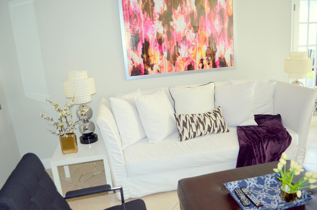
So the framed print above the couch adds a tremendous amount to the room, it's always good to wait to find something great rather than a fill in. The throw and blue tray add some color to the room, and having extra seating definitely helps the room. I'm still not crazy about those white side tables, I'm in the process of getting new ones.
The mirror is still there and just get better. Mirrors always add light and space to a room. That's one thing that hasn't changed yet.
This is the dining area with lots of potential. The gallery wall of black and white trees I still love. I took those while I was by Central Park once, although they're hanging a little too high and so is that art piece. Tip; if you need to tilt your neck up to see what's hanging up on the wall, don't bother because it's not worth it. The light fixture is not good at all but it's something that's not worth fixing while renting for a few years.
The second picture is the other wall in the dining room. The painting is very sentimental to the family, and I love it so we put it up. The painting desperately needs a frame which I haven't done yet. When I hung the painting I decided to add a shelf and try channeling some Emily Henderson styling, but that blew up in my face. (For any Arrested Development fans, the Tobias quote "I just blew myself" seems appropriate.)
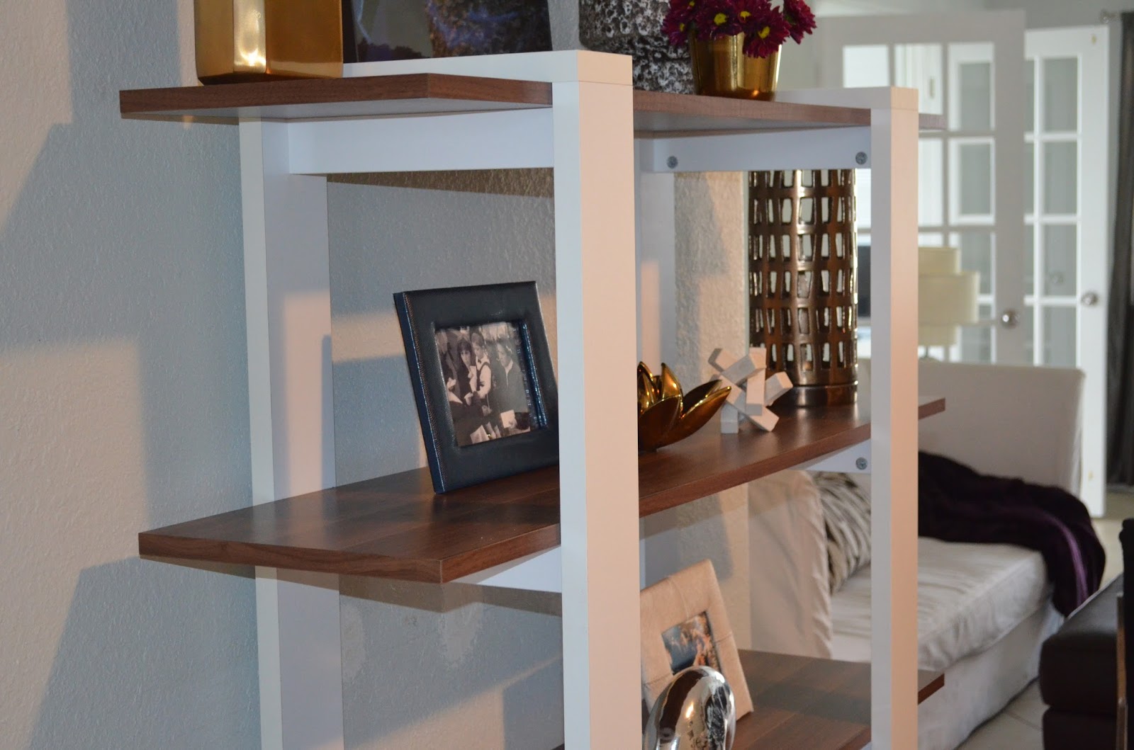
So the shelf was replaced by the this perfect book shelf. Someone I know was moving so I got lucky and bought it off her, I love it and I will eventually be putting books there. The shelves add so much more detail and interest to the room.
I don't know if this close up makes the shelves and styling look better or worse.
So to sum up my tips;
-fake orchids can die just like real orchids
-you never need three of exactly the same thing
-it's better not to have a rug than to have one that's too small
-Stay away from any floor lamps that have helmet tops
-luggage should be in a storage room or garage
-Don't underestimate the power of flea markets; those two black arm chairs were under $200
I haven't finished the bedrooms yet but when I do I will happily write a follow up post.
It's been determined by psychologists that color has an immediate and lasting effect. Colors influence mood, shapes, perspective and the overall impression you make on a person. Knowing the right color palette for yourself can only help you look younger, healthier, more energetic and vibrant. Discovering your colors is a crucial part of feeling empowered and confident. I'm not a color palette expert so I can't really help you in that area but don't stop reading, I do have what to offer. I'm going to help those who already know their palettes, or have an inkling where they might fall, translate that into an interior space. I had high demand for this subject matter and I like to please my followers. (My cousin asked me so I responded.)
Winter Palette; Dramatic, high contrast and deep colors. Think of black, pure white, charcoal, burgundy, icy pink and brown black. When looking to translate this palette into an interior, there's two ways you can go about it. You can take it literally:
You can have a space like this. A lot of chrome, high contrast with patterns to create the palette. If you want to take a less literal approach, you can create a space like this:
This space has the winter color palette but not as harsh. The mirror is sculptural and so are the chairs and light fixture but the colors stay simple and understated.
Spring Palette; Bright, colorful, happy and clear colors. The spring palette has saturated colors with high contrast warm colors, like burnt orange and hot pink.
This entry way is a good example of a spring palette because it's bright and clear. The side table with the curved legs and rococo mirror on top are really intricate and feminine. I love that light sky blue front door it's so refreshing, happy and welcoming; those are the same adjectives used to describe me.
Hello gorgeous. This beautiful, brightly colored space was done by Emily Henderson, I love her and hate her at the same time. She makes it hard for someone like me who has three freelance jobs a year to believe in myself. This is a beautiful spring palette inspired space. The pale turquoise with plum flowers and pops of gold make me very happy.
Summer Palette; Pastel and medium colors with medium intensity. The summer palette is very soft and delicate and easy going.
I love this dining area because it's so bold,
David Bromstad would really appreciate this space. This is a cooler more edgy summer inspired space.
This is a kitchen nook done by Angie Hranowsky, it's soft with light colors that soothe and relax you. It has a little bit of that boho vibe which is perfect for the summer. I'm wondering if this soothing color palette would help a person (who's an emotional eater) eat less or have less emotion.
Fall Palette; Warm deep colors with gold and jewel undertones. Think of olive greens, camels and browns with deep reds and blues.
This is a nice vignette with warm tones. The colors aren't so deep but they're warm and the shapes are very organic.
This fireplace is gorgeous, I love the shape and texture of it........ all that gold is overwhelming in a good way. The round red sofa with the white shag rug is perfect for the fall palette and a trip to the 70s. I love this so much.
This post should show you that I take requests really really well. You should start putting in your requests now because one day I'll be world famous and I wont be as accommodating.
Once upon a time a man and woman fell in love and decided to live together forever under the same roof. One day, the woman came home and found a small mountain of nail clippings on the coffee table and asked herself, "Did I think I was living with a human and in reality he's an ape?" The man later explained he intended to throw the nails away when the play-offs were over. And so begins the wonderful journey.....
For any space it's important to create the right balance between colors and shapes; even more so when working with a couple. When men and women join parties it's a difficult task to show both perspectives in their shared space. He wants a fish tank that runs across the whole wall and she wants lots of frames with pictures where she looks good and he looks really cute (fat.) A tip for the ladies: it's best to let him think he's part of the design process like when he comes up with the idea of built in cup holders in the arm rests, nod your head in agreement and then do the exact opposite.
Here are some examples of a spaces working for couples living together;
This space blends both interests together seamlessly. The color palette is neutral and soft, the shapes are varied from severe to curved and it's not over accessorized. Had those womb chairs been darker it would have felt more grounded and masculine. The drapes in the background also add softness.
Again this is a more neutral color palette but the neutrals are darker. The sofa and arm chair are very masculine in their shape so the throw and pillows tossed around work well to soften it. The different sized bowls and flowers on the coffee table bring in femininity and so does the rug; it's a strong pattern with a very soft texture. The core pieces in this room are very dominant so accessorizing becomes the balance of the room.
This is another example of a balanced space, it does lean a little more to the feminine side with the zebra ottoman and that sculpture light fixture. With the rug, walnut wood chair, muted colors and simple architecture, the room works nicely together.
Here are examples of spaces working for just the women:
This room is really pretty, warm, layered and welcoming; to most people besides men. There are way too many blush tones in this
room for a man to feel comfortable with. It would take one time for the guy to stand up from the couch and knock his head into that petite dollhouse-like chandelier.
For a guy to live in this room, it would be like him saying he likes it when women wear harem pants;
Ladies think this is the hottest coolest thing right now, the men on the other hand think we should keep these pants in the Disney movie 'Aladdin' where they belong.
I love this little vignette, it's almost like a period piece. This delicate corner has everything on the feminine check list;
-the floral wallpaper
-the crystal chandelier
-the vintage shaped mirror, that's hanging from a ribbon
-the 'flea-market-feel' chair and table
-framed butterflies
This vignette leaves women lingering and men running.
Here are some spaces that work well for the men:
I think a man should be scared to bring a woman into this room, within days there would be an area rug, the pillows would slowly become smaller and fluffier and there would be a bunch of little things on the coffee table leaving no room for anything practical.
I happen to appreciate the simplicity of this bedroom but I don't know if other women would share my opinion. Maybe it's the lack of color or the vastly empty brick wall, but this bedroom needs a little TLC from a woman.
This bedroom is done really well. The blues, camels and light greys are all more masculine but with all the fabric and textures it brings in the feminine. The walls are padded, there's wall to wall carpeting, the drapes are full, the throw on the bed looks luxurious and the stools outside with the white pendant by the bed bring in all the softness the room needs for a perfect coupling. Jeff Andrews was the creator of this room. He is one of my favorite designers, if you request it, I can write a whole post on him :)
Just make a request in one of the many comments you plan on writing.... yes that's a hint.