I just came across Angie Hranowsky, Graphic and Interior designer. I know she has been discovered years ago and I'm a little late but I'm happy I'm here. She is everything I aspire to be, I love all of her interiors. Angie lives in Charleston, South Carolina where she spotted an open layout house for sale and turned it into this gorgeous space.
This is the living room. So beautiful, the color palette is perfect with the neutral warm colors mixed in with purples.
Angie put in a gallery wall that goes all the way from the living area to the dining area. It's a collection of art from all her years. I absolutely love how this is done.
The home has a really cozy feeling, I think choosing a zebra hide that is brown and white instead of black and white was a good decision for warmth.
Look at the details of the living room, everything feels so effortless. The way the tulips fall is beautiful in a very natural way.
This den has a great mix of warmth and retro. The geometric room divider is strong and simple and the curves in the den balance beautifully. I love this den, I want this den.
Just when I thought it couldn't get any better I see this kitchen. I mean I'm in love. Those lucite bar stools from the 70s are killing me. Love those floating shelves over Ann Sacks tile. That's a great use of a small wall space. Those two pictures in her kitchen are silhouettes of her two children- I know so cute.
Yes somebody sleeps here and it's not you; it's Angie. Glamorous canopy bed, great Suzani blanket and perfect color combination.
And this is her entry way. She probably can't keep people from coming in with a view like this.
Her style is effortless, relaxed and modern. The pieces from one room to the next all connect with each other and tell a story. Love this home, Love her work.
So my family and I recently moved into a new apartment which is really great. I decided to take things slow, look around and make bigger better purchases in this new place. Taking things slow sounds much easier than it actually is. I'm starting to learn a few things in the process of designing my own home, for example, don't under estimate the power of a good fragrance candle. It really creates a feeling of home and peace. Another thing I've picked up is don't ask your husband "his advice" on a piece of furniture or accessory. He will either tell you to wait and look around, which really means "wait and look around so you get distracted and forget about the purchase" or he'll ask you "didn't you just buy something similar?" For those and other reasons, it's best to keep the husband out of decor decisions.
My next project is the home office. It's always good to have a home office, whether you're working or not. It's a good space to designate computer time, hobby time and organize papers. I'm in the middle of looking for some inspiration to go off for the office...
So there's this which I really like. It's small and sweet and is probably most productive for those who can work from a laptop - that would be me.
This is Art Entoure Interiors, love this room. I'm heavily leaning towards this, the natural wooden table with the chair. I am loving that watercolor painting. My office wouldn't have an apple computer though. I would have the loser half cousin of apple; toshiba.
This is the office of Lonny's editor in chief Michelle Adams, Lonng Mag. I love this office. It feels chic and rock and roll. It's so cool I'm questioning my ability to pull off an office like this.
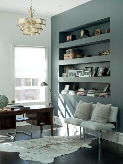
This is so sophisticated and glamorous. I like the built in shelves, I love the white side chairs and cowhide. The wooden desk with the globe on top reads a little elementary teacher, but I'm into it.
This is a sexy color palette.
This is David Jimenez http://www.djimenez.com/.
I really like a lot about this:
Gallery wall- check
tan leather chair- check
gold hexagon stool- check
black and white cowhide- check
I don't know if I'm mature enough for this office space though. I feel like I can't make any mistakes in here.
So whoever is reading this blog (besides my mother) what do you think..any favorites?
Black is a mysterious, bold, intense, abstract, cool, very versatile color. I want to help those of you who are intimidated by the idea of using black in an interior or in your wardrobe. There's no such thing as too much black and I'm going to show you why.
Using black as a focal point...
The black wall in this bathroom is a focal point because it's surrounded by all this light. The white tiles in the shower, the white bath tub, the white sheepskin rug, the crystals from the chandelier. Everything in the bathroom is playing the opposite role of the black wall creating a beautiful contrast; which makes this black wall like a gorgeous painting.
Using black for the mood...
Now this is how you embrace the dark side. The mood in this nook feels really mysterious and sensual. The texture on this wall (using the paint technique of venetian plaster) plays up the already moody feeling from the black. The mirror is very small but makes a big impact because of all its details. The mirror being small gives the black walls more room to shine and create a cozy ambience.
Using black as a backdrop.....
The black wall acts as a beautiful backdrop to the painting, beautiful lamp and the light fixture. The white in all these pieces bounce off the black wall making it come alive.
Using black as an entrance....
This dining room designed by Nicole Cohen, (it's her painting in the background as well, check out her other work at sketch42blog.com) used black to paint the doors on the left. Doors painted any color adds a lot but especially in black, it creates a great statement. With these doors in particular with architectural detailing the black really works.
Using black throughout...
This eating area is gorgeous, one of my favorite designs. This space has a neutral color palette- with the pop of red tulips- using black throughout. The black and white picture covering the whole wall work really well with the transparency of the light fixture and table, which is glass. I love the use of black here, it's mixed in well to ground the space and not overwhelm it.
Using black for stairs...
This is totally genius. These black stairs are perfect especially against the white wall. It lets people know where they're going and draws your eye all the way to the top.
Using black to ground things...
Hold on, I just need to take a moment and stare at this picture. This breakfast area is my dream because it feels casual and glamorous. The jet black cowhide does such a good job of grounding the area, separating it from the rest of the kitchen.
Rooms are always better when you know the purpose for them, people need you to tell them what they're supposed to be doing in that room.
Using black in your wardrobe...
Are you thinking what I'm thinking? (Elin Kling is the bomb. Stylebykling.nowmanifest.com.) This black/leather get up is really really done well. The white tshirt helps to break things up but the different textures do as well. This is black done well.
Using black as an accessory....
Mary kate Olsen (I've mentioned I used to have a girl crush on her and Ashley right?) using a black feather hair piece.
Here, she uses black for all of her accessories. The shoes, belt and sunglasses which does this dress a lot of favors.
Using black for a message...
Her message says "I'm approachable but don't come too close."
Her message is "I don't have to try so hard to look amazing." (We don't really like her message, it's not fair to the rest of us.)
Her message is "I don't need to wear tops anymore."
It's amazing to think that one color can be so many things when done right.