Remember when I wrote the apartment post and then promised to do write a bedroom edition? Whoever started losing faith, shame on you.
Welcome to the bedroom edition, I'm starting with the baby's bedroom/ playroom/ guest room. This was a more challenging room to pull together because it is so multi-functional. Its my daughters bedroom, its a guestroom whenever we have people over and its a play room with too many toys. I kept coming back to the same question: How do I make this an enjoyable, kid friendly room and keep it clean and stylish for guests. For a while all my answers were terrible design solutions. I don't know why I'm comfortable to share all these mistakes with you, but I am so take advantage and put on your learning caps.
The start of the process;
This was taken a few weeks after we moved into the apartment so this wasn't part of a plan. Things were just placed down and left there til further notice. I hope you can all appreciate the vulnerability of this picture.
Another view of the beautiful room. You know it takes a true designer to show the public their mistakes (or a total idiot who is shooting themselves in the foot.) Either way, it's happening and there's no turning back.
This was one of my first attempts to bring some life into the room. I put up some pin boards and plastered pictures all over it, then added mirrored butterflies. The concept? A fun and collective way to bring in some color and life. The result? Something that is unattractive to the eye.
Attempt number 2, I went for something slightly more ethereal with the branch and bird..it was a nice vignette for a picture but didn't last much longer than that.
The lights were put up,which are still there and still look good. The curtains I made because I wanted the room to feel more feminine but I wanted the color palette to stay neutral- so you see I started off with good intentions.
This picture is very dark but looking back I'm happy because it only gets worse in the light of day. There are a lot of windows in this room so choosing curtains like this was more like painting a flower mural on the walls- something I should of put more thought into.
We installed these two shelves to display dolls and other cute things. It's a nice idea but when executed like in the above picture it leaves a room feeling lost of direction. The shelves are displaying black vases, a gold over sized 'E', vintage cabbage patch dolls, a white porcelain bird... there is too much going on. There is a better way to display, for example;
The reason why this works is because it's a mixture of prints, books and toys all in the same color family. It's also edited really well to feel deliberate and thought out instead of over excited and over crowded.
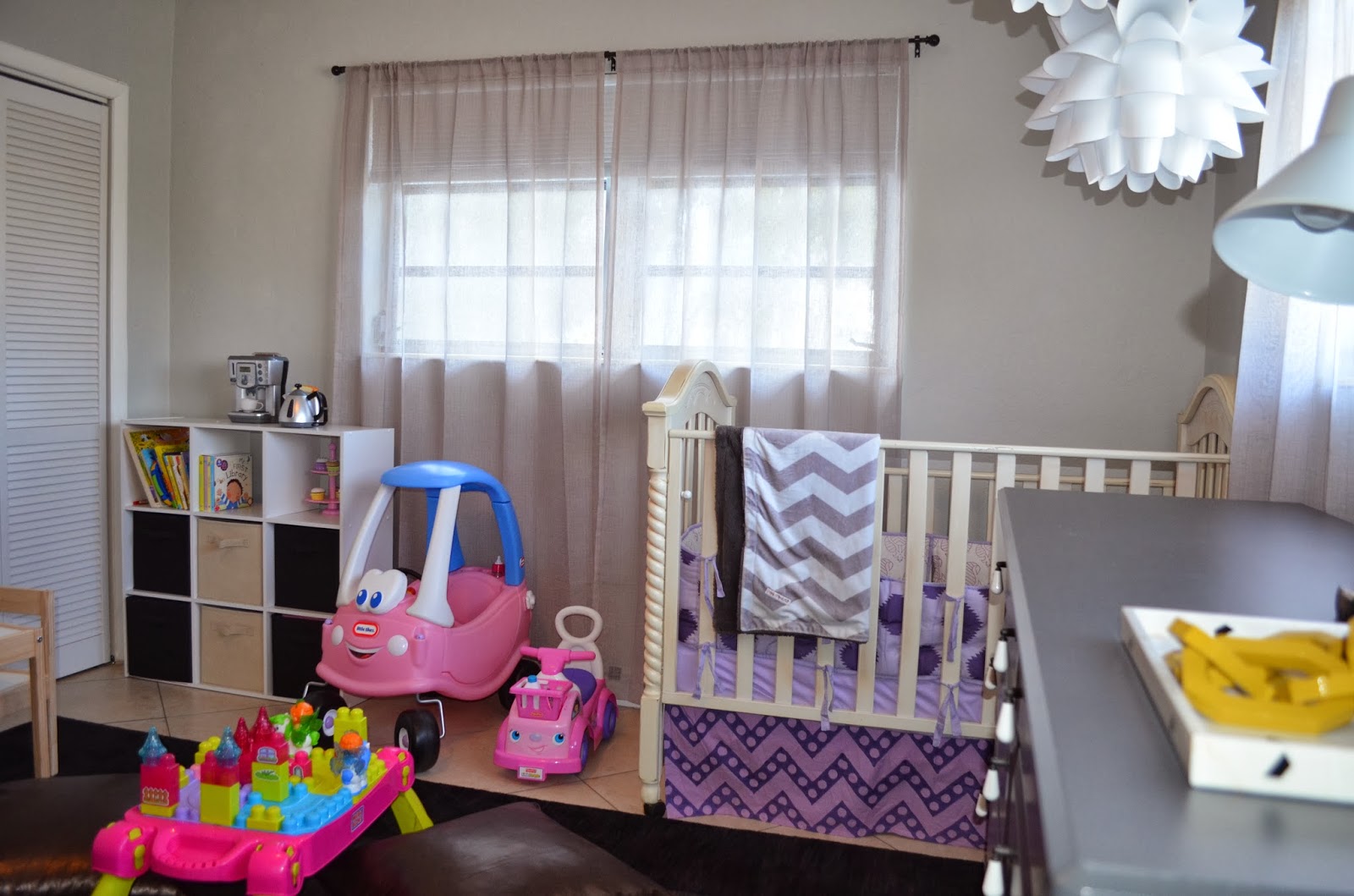
The inspiration for this make over were pictures my sister in law took of my daughter. Check her out on Facebook and Instagram @themodreport; prepare to be blown away. Once those pictures were taken I found my color palette and never looked back. The room before was lost and now it had been found. The palette was soft but not feminine.
A close up of the pictures.
I chose sheer curtains that were very close to the wall color to make the room seem bigger, the curtains are seamless with the walls and because they're sheer all the light comes into the room really nicely.
Switching out the curtains brought a lot of serenity to the room and gave the room a soft backdrop that adds and doesn't distract.
Some bedside table styling tips; try to have fresh flowers. It always adds a good pick me up. Another thing to always try to have is a tray. It's good for when you have guests or without guests because suddenly miscellaneous objects have a place to call home. Miscellaneous objects without a place to call home start to look like junk.
This print is by Clinton Friedman, a south African photographer who is perfect at capturing the essence of nature. Check out his work here. I wanted something unexpected and raw for the room.
Looking at this picture it's hard to see past all the pink and sparkle. Does the pink and sparkle compliment my color palette? Not exactly, but do I have warm feelings towards my daughter and ultimately want her to be happy? Yes, and lucky for me that mega blocks table can be folded up and put away when not being used.
The table and chairs are from IKEA, the whole set is $20 and gives kids a good space to play. The table and chairs helped transform the room into more of a playroom.
Copper leather floor pillows may seem unconventional to some but to me there shouldn't be any other kind. They are beautiful, durable and easy to clean.
Nothing tells a guest 'we're happy to have you' like flowers and a candle. Just make sure not to leave a drink or snacks because then you will have to quietly pack up your guests bags, put them by the front door and hope they understand the message you are sending. If they don't understand then it's time for you to find new house guests and a new home address.
Stay tuned for Part Two of the Bedroom Edition.
For those of you worried that I stopped blogging, you can stop because I am still here. I figured since I officially have two followers the lack of posts wouldn't cause too much distress. Before I post about my recent projects, yes that's projects with an 's'- there has been more than one, I wanted to go back to a classic- which is interpreting the style of awesome ladies into interior spaces.
I don't want to focus on her bony chest but I definitely want to point it out........................... I love the soft pink cashmere sweater paired with the loose, white skirt- that also has pom poms. This is an easy outfit that's free and organic. The gold bracelet is the only thing that has form and sharp edges so I think it's a perfect accessory for this outfit. And those sunglasses are very cool, they tell us she's the type who can go to an Ultra concert but knows the difference between a human and a tree.
This would be where she finds solitude and gets some work done. The form of the fiddle leaf tree in the background is so beautiful and I love how the lamp mimics that shape. The black and brass chair grounds the corner with the Lucite chairs and white cowhides. Then there's the wallpaper and light fixture. The wallpaper is awesome and I'm still not sure how I feel about that caged light bulb. A part of me thinks it's beautiful and the other part tells me I should try and help.
I love those overalls with the leather jacket wrapped around her hips; She has a very down-to-earth tomboy vibe. The vintage camera she's sporting tells us she likes a good mix of old and new. And anyone who likes a good mix knows good design.
This vignette would definitely be part of her home. Its collected, a little messy and beautifully eclectic. Anyone who has a naked sculpture of a woman in blue is either crazy or has an eye for art. I'm going with 'an eye for art' because that sculpture is pretty amazing. I love how this little area breaks all the 'rules' so perfectly.
What's worse than one awesomely dressed woman?Yes, two of them. Although I have to admit I like the woman on the left with the sweatshirt and blue and white pants. She looks more effortless and comfortable. Her friend looks cool, a little house on the prairie for me but I still like it. These two women combine classic, traditional with modern ease.
This is what their shared space would look like. This room is very traditional for the most part but feels current because of the color choices. The neoclassic chair, the skirted ottoman and plush chairs would usually feel dated in other surroundings but with the chandelier and the dark painted side room this space feels modern.
This woman is bohemian, grungy, minimal, chic and all of the above. I love the way she looks. I even like how easy going she is about hailing a cab. Is it just me or does the woman behind her on the left look really annoyed? Nobody asked her to put on a Parker puff jacket.....
This would be her space because it's all of the above. It's sophisticated, laid back, modern and has a little boho spirit. All the color is coming from flowers, art or lemons. The foundation of the room is minimal and timeless- just the way I like it. The light fixture is also just the way I like it, grouped together in different sizes and at different lengths. #failproof.
Stay tuned for upcoming posts on beautiful transformations. I'm excited. Even when I'm excited I don't use exclamation marks, it's too much of a commitment.
Learning to style a bookshelf can be daunting and frustrating because it's a multifunctional piece that above all else needs to be functional. When done right a bookshelf can be the focus of something really beautiful, but when done wrong it can be the focus of a traumatic visit for your guest. For those of you that have bookshelves causing your guests discomfort, I want to help you. Here are some rules/tips to help give you some direction.
Rule One: Think Outside the Box.
A bookshelf doesn't only have to have books with a little frame that says "Keep Calm." It's important to vary the objects that you're using and try not to limit yourself.
This bookshelf is such a good example of awesome styling. The bookshelf is a very standard and popular one from IKEA and you can barely tell because it stands out and looks completely individual. The big print on top is great because it helps give the illusion of the bookshelf being taller and adds something graphic. All the little objects throughout create a story; the plant, the branch on a stand, the brass horse. All these objects express a personal style.
This is another example of great bookshelf styling. I love the rock crystal bookend on the top shelf, the plant is beautiful because it's sculptural and the pot is pretty too. The three small painted canvases on the second shelf are a really nice touch, they're handcrafted and unexpected. Everything here is nicely layered without feeling cluttered.
Rule Two: Use Different Shapes.
You never want your shelves to feel boring or too repetitive and because essentially you're using your bookshelf for books, you need to take advantage of the shapes you're choosing to incorporate.
So this bookshelf was done by Emily Henderson so naturally it's styled to perfection. This bookshelf has a lot of books laid out horizontally and vertically with something sweet on each shelf. You have books stacked with a little gold bowl on top, and then you have books lined up with a piece of art at the end. This keeps it feeling fresh and unexpected. Screw you, Emily Henderson. I'm just joking, call me instead.
So I think this is the mother of all examples of playing around with shapes. Take a look at that bird, definitely a different shape than all the books, and it totally works. I love the styling of these shelves, with the picture frames and miniture elephant. It's done really well.
This is good for people who want to keep their bookshelves for books instead of a lot of objects. But even though it's full of books it still has the pretty moments with the gold fish on a stand displayed with an Andy Warhol book.
Rule Three: Flowers and Nature.
Adding
flowers and plants to any styling surface is always a must and bookshelves are no exception. It brings
in life, color and shape and executes the finish product beautifully.
So this was also done by Emily Henderson, and here we see flowers being represented in wallpaper- a pretty damn good one. It's a gorgeous backdrop for those white open shelves. Keep in mind this can be done in your own home: Purchase the shelves from IKEA and before putting them up apply self adhesive wallpaper of your choice. I can't guarantee it will look this good or end up all over pinterest, but if it doesn't work out at least no one will ever know about it. With these open shelves the books are laid out neatly with a few nick nacks here and there to break it up. Have you ever seen better use of a fern? I love a nicely messy fern and this one looks so bright against the black and gold.

So here the flowered branches not only add something natural but it adds height and sculptural to these shelves. Branches are great for taking up a big amount of otherwise 'dead' space and still being sparse. This was done by Emily Henderson as well...... this is getting embarrassing already. I have an undying love for her that you all need to read about. I thought I got it out of my system with that post dedicated to her, but apparently not.
Fail-Proof Objects for Styling
There are some things that can be used anywhere and with any placement that will always add interest and style.
On top of these gorgeous nesting tables is a candle holder from CB2. I've purchased two of them and they're amazing. Their size is nice and big and feel very substantial. I change them around and move them constantly. I've split them up and use the bigger flower for keys and sunglasses by the front door. Find it here http://www.cb2.com/2-piece-dahlia-candleholder-set/f7897
This is an elephant tealight holder from Nate Berkus's line at Target. I have gone to Target every time he comes out with new designs (I'm not afraid to admit it) and it only gets better. This is really cute for layering, you can place it on top of a stack of books or grouped with a vase of flowers. Find it here http://www.target.com/p/nate-berkus-trade-elephant-tealight-holder/-/A-14578470#prodSlot=medium_1_13
Another piece from Nate's line for Target. This is great because it's a good shape and it can used in so many ways. You can stack them up on top of each other or you can separate them and use them as bookends. Click here http://www.target.com/p/nate-berkus-decorative-oversized-nut-figural-gold/-/A-14440338#prodSlot=medium_1_37
I love these Carla Peters vases from West Elm. They're good for styling because they look good with or without flowers. You can leave them empty and the design and shape will still add so much to what you're styling. Find them here http://www.westelm.com/shop/accessories-pillows/vases-botanicals/?cm_type=gnav
Don't underestimate the power of pretty boxes. Traditionally they're used for jewelry but tv remotes fit inside just fine and add some glamor to your coffee table or side table. I use little boxes all the time to hide miscellaneous things from around the house. It works for me and not my husband because he can never find anything. I understand where he's coming from but they're just so pretty :)
Click here http://www.westelm.com/products/brushstroke-jewelry-box-d1850/?pkey=cjewelry-box-storage&cm_src=jewelry-box-storage||NoFacet-_-NoFacet-_--_-
These are paperweight glass knots that come in all different colors and are truly perfect for styling. They can be put anywhere, on top or in front, and add something sculptural. I love them all and want them all but I am literally running out of room in my apartment. Click here http://www.westelm.com/shop/accessories-pillows/decorative-objects/?cm_type=gnav
This is a great book about styling and knowing your personal style. It's a good read and it's a good addition for your bookshelf. Find it here http://www.amazon.com/Decorate-Workshop-Design-Style-Creative/dp/1452110646/ref=pd_sim_b_10
So when styling your bookshelf have in mind that to keep things interesting you need to be aware to use different colors and shapes throughout the shelves. And don't rush, it's fine to wait and do the process over a period of time and create a more collected feeling rather than buying out the whole accessories department in Target. Trust me, I've been there and you just feel shame.
I moved into my apartment last year April and it's not done and is constantly being redone. My poor husband and baby have to put up with me rearranging everything and I always want him to love what I've done. He's not great with change so by the time he likes something, I've decided to change it; It's a tough cycle for him. My apartment is my free zone to experiment with different lay outs, color combinations and materials. When you first move into a place it's hard to know how the space will be used and I found with myself that it took some time to find a good balance with my apartment after I was living in it. Maybe I'll start telling future clients that I'll do a better job if I move into their home for a short while.
So let's look at my place when we first moved in:
Entry ways are always the best way to showcase your style. Even if you don't have an actual entry way it's easy to create one. In the beginning mine was the picture above. A vase full of branches and multiple gold flower bowls. Two things could of been going on in my head; it was hard for me to decide between three of the same things so I just displayed all of them or I thought we would be sharing an apartment with other families so we would need a lot of space for keys.
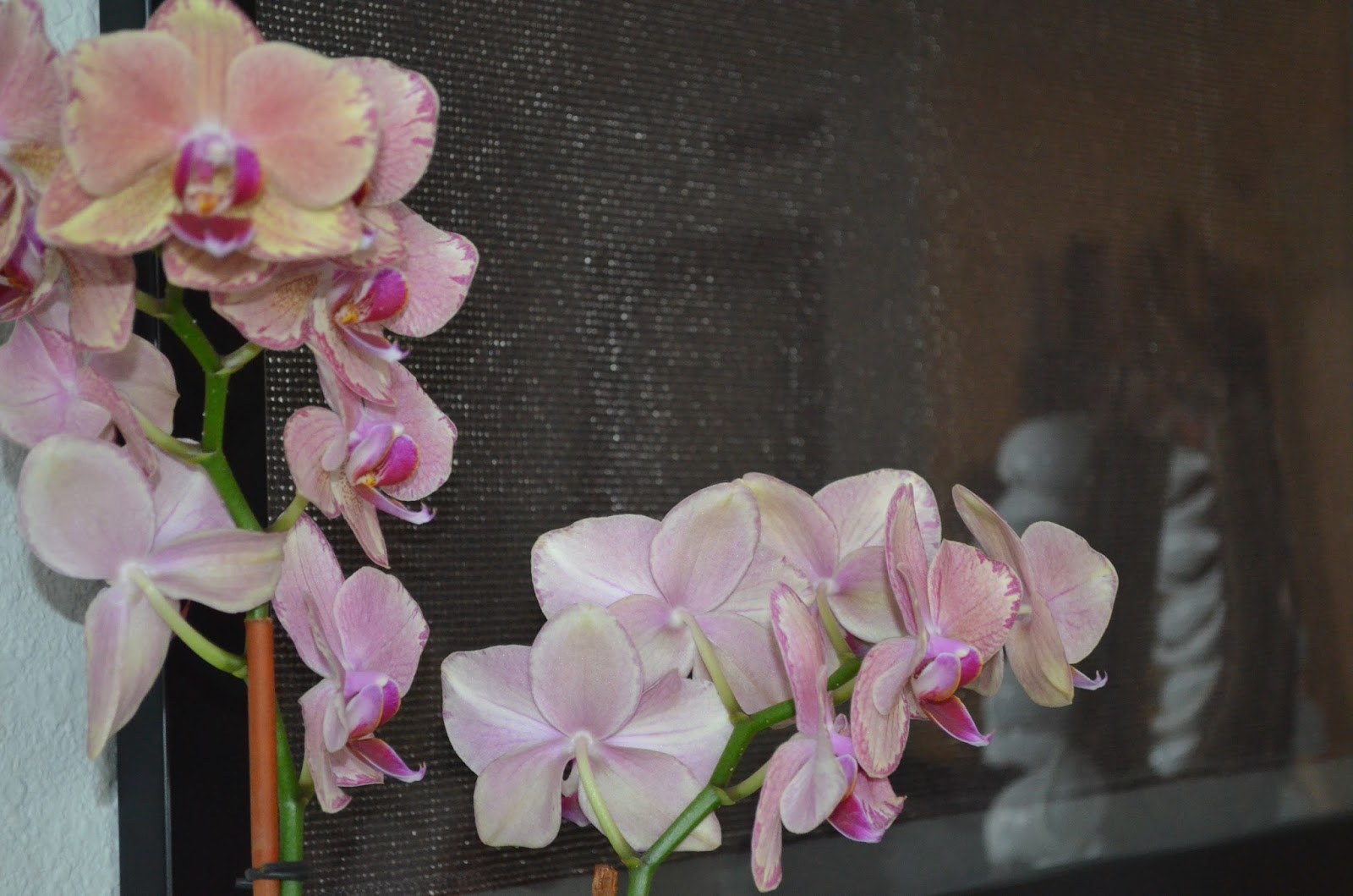
This is the entry way now and I settled on one gold flower bowl and it's more than enough. The shell necklace I purchased on a trip home to Australia. I was told it was a tribal head piece but it could easily be shells sewn onto fabric. Either way I love it, and the orchid is perfect there, it brings in color and height.
I once got a sample of fabric that I loved and instead of using it I framed it.
The apartment isn't this dark, it's the lighting of this picture. The table, lamps and accessories are all great, but it feels very empty and that dorm-like window stands out like a sore thumb. A tip for my old self, if you're going to buy an awesome bronze mail stand, make sure you fill it up with mail instead of two pieces of paper bent over like that. I feel hopeless looking at that mail, it's so depressing.
The curtains do an amazing job at hiding that window and adding some layers. Those curtains are actually from Target, yes Target. Nate Berkus designed a home line for them and I got those for under $50. The grey works well against the woods and do you see how we've grown in the mail receiving department? It's now full of promise (and bills). I also added a small set of drawers to help hide the cords from the lamps because they just added to the depressing feeling.


We have a third room when you walk into the apartment, it's a really nice addition and I love the french doors. I don't love what I originally filled it up with. Using a room with french doors to store luggage is never a good idea- people can see it right when they walk in. The lamp was appealing to me at first because of the mid century shape of it but after I got home it started to look like a soldiers helmet. The lay out of the room is not great, the couch at the end of the room is hard to get to through an over sized desk and wall of suitcases that makes you feel like you're at baggage claim.
Here's a shot of the room from the other side, it's just more helmet and a fake orchid that miraculously managed to die. Another helpful tip, don't place a bookshelf in front of a french door.
So I moved the room around, creating more floor space. The desk is now smaller and fits into that space by the door and only takes up a small portion of the room. I love the plants in the room, that room is full of windows so it's a great place to have plants. The rug and floor pillows make the room lounge-y and comfortable. Another great tip, Home Goods is always worth a try- that rug was $90 and it's so gorgeous and durable.
I wanted to add some excitement to the leopard and black pillows but I couldn't find exactly what I was looking for. I went to Walmart and found the gold and silver material and took the fabric to a dressmaker to make the pillows and I'm very happy with the result. I should take all these good ideas and become a designer.

So this is a cute start to something that will later evolve into something that actually looks good. The first thing I've learnt since then is to get a rug that fits the size of the room. This purple rug looks like an over sized play mat, it actually makes this open space feel smaller. The nothingness on top of the couch obviously does nothing for the room (don't judge me I was waiting for the right thing- which is advice I would pass on) The pillows were ok for the first few days but then I started getting a lot of complaints about the amount of pillows on the couch. A tip, if the back of the couch is made up of pillows you probably don't need to add 'throw pillows.' That is a bad idea. And it's also a good idea to have extra seating for guests. When we would have guests over my husband and I would pretend we liked standing while watching a movie because it helped the blood flow.

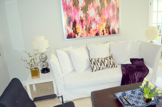
So the framed print above the couch adds a tremendous amount to the room, it's always good to wait to find something great rather than a fill in. The throw and blue tray add some color to the room, and having extra seating definitely helps the room. I'm still not crazy about those white side tables, I'm in the process of getting new ones.
The mirror is still there and just get better. Mirrors always add light and space to a room. That's one thing that hasn't changed yet.
This is the dining area with lots of potential. The gallery wall of black and white trees I still love. I took those while I was by Central Park once, although they're hanging a little too high and so is that art piece. Tip; if you need to tilt your neck up to see what's hanging up on the wall, don't bother because it's not worth it. The light fixture is not good at all but it's something that's not worth fixing while renting for a few years.
The second picture is the other wall in the dining room. The painting is very sentimental to the family, and I love it so we put it up. The painting desperately needs a frame which I haven't done yet. When I hung the painting I decided to add a shelf and try channeling some Emily Henderson styling, but that blew up in my face. (For any Arrested Development fans, the Tobias quote "I just blew myself" seems appropriate.)
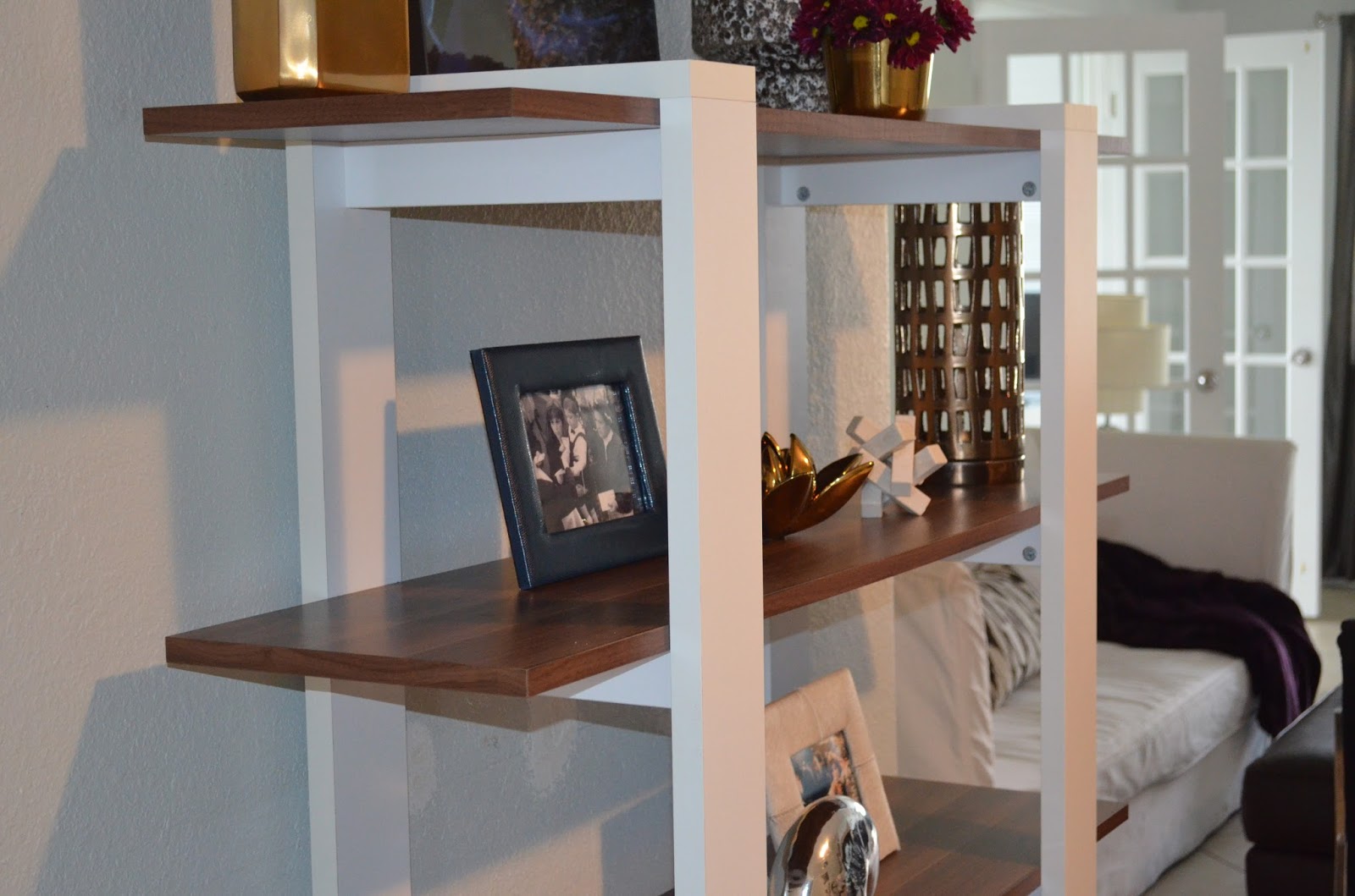
So the shelf was replaced by the this perfect book shelf. Someone I know was moving so I got lucky and bought it off her, I love it and I will eventually be putting books there. The shelves add so much more detail and interest to the room.
I don't know if this close up makes the shelves and styling look better or worse.
So to sum up my tips;
-fake orchids can die just like real orchids
-you never need three of exactly the same thing
-it's better not to have a rug than to have one that's too small
-Stay away from any floor lamps that have helmet tops
-luggage should be in a storage room or garage
-Don't underestimate the power of flea markets; those two black arm chairs were under $200
I haven't finished the bedrooms yet but when I do I will happily write a follow up post.