Welcome to the bedroom edition, I'm starting with the baby's bedroom/ playroom/ guest room. This was a more challenging room to pull together because it is so multi-functional. Its my daughters bedroom, its a guestroom whenever we have people over and its a play room with too many toys. I kept coming back to the same question: How do I make this an enjoyable, kid friendly room and keep it clean and stylish for guests. For a while all my answers were terrible design solutions. I don't know why I'm comfortable to share all these mistakes with you, but I am so take advantage and put on your learning caps.
The start of the process;
This was taken a few weeks after we moved into the apartment so this wasn't part of a plan. Things were just placed down and left there til further notice. I hope you can all appreciate the vulnerability of this picture.
Another view of the beautiful room. You know it takes a true designer to show the public their mistakes (or a total idiot who is shooting themselves in the foot.) Either way, it's happening and there's no turning back.
This was one of my first attempts to bring some life into the room. I put up some pin boards and plastered pictures all over it, then added mirrored butterflies. The concept? A fun and collective way to bring in some color and life. The result? Something that is unattractive to the eye.
Attempt number 2, I went for something slightly more ethereal with the branch and bird..it was a nice vignette for a picture but didn't last much longer than that.
The lights were put up,which are still there and still look good. The curtains I made because I wanted the room to feel more feminine but I wanted the color palette to stay neutral- so you see I started off with good intentions.
This picture is very dark but looking back I'm happy because it only gets worse in the light of day. There are a lot of windows in this room so choosing curtains like this was more like painting a flower mural on the walls- something I should of put more thought into.
We installed these two shelves to display dolls and other cute things. It's a nice idea but when executed like in the above picture it leaves a room feeling lost of direction. The shelves are displaying black vases, a gold over sized 'E', vintage cabbage patch dolls, a white porcelain bird... there is too much going on. There is a better way to display, for example;
The reason why this works is because it's a mixture of prints, books and toys all in the same color family. It's also edited really well to feel deliberate and thought out instead of over excited and over crowded.
The inspiration for this make over were pictures my sister in law took of my daughter. Check her out on Facebook and Instagram @themodreport; prepare to be blown away. Once those pictures were taken I found my color palette and never looked back. The room before was lost and now it had been found. The palette was soft but not feminine.
A close up of the pictures.
I chose sheer curtains that were very close to the wall color to make the room seem bigger, the curtains are seamless with the walls and because they're sheer all the light comes into the room really nicely.
Switching out the curtains brought a lot of serenity to the room and gave the room a soft backdrop that adds and doesn't distract.
Some bedside table styling tips; try to have fresh flowers. It always adds a good pick me up. Another thing to always try to have is a tray. It's good for when you have guests or without guests because suddenly miscellaneous objects have a place to call home. Miscellaneous objects without a place to call home start to look like junk.
This print is by Clinton Friedman, a south African photographer who is perfect at capturing the essence of nature. Check out his work here. I wanted something unexpected and raw for the room.
Looking at this picture it's hard to see past all the pink and sparkle. Does the pink and sparkle compliment my color palette? Not exactly, but do I have warm feelings towards my daughter and ultimately want her to be happy? Yes, and lucky for me that mega blocks table can be folded up and put away when not being used.
The table and chairs are from IKEA, the whole set is $20 and gives kids a good space to play. The table and chairs helped transform the room into more of a playroom.
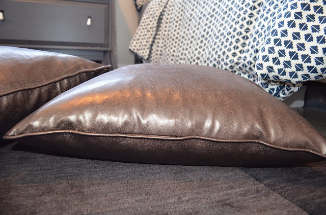
Copper leather floor pillows may seem unconventional to some but to me there shouldn't be any other kind. They are beautiful, durable and easy to clean.
Nothing tells a guest 'we're happy to have you' like flowers and a candle. Just make sure not to leave a drink or snacks because then you will have to quietly pack up your guests bags, put them by the front door and hope they understand the message you are sending. If they don't understand then it's time for you to find new house guests and a new home address.
Stay tuned for Part Two of the Bedroom Edition.


No comments:
Post a Comment